subscribe("mediaquery", callback)
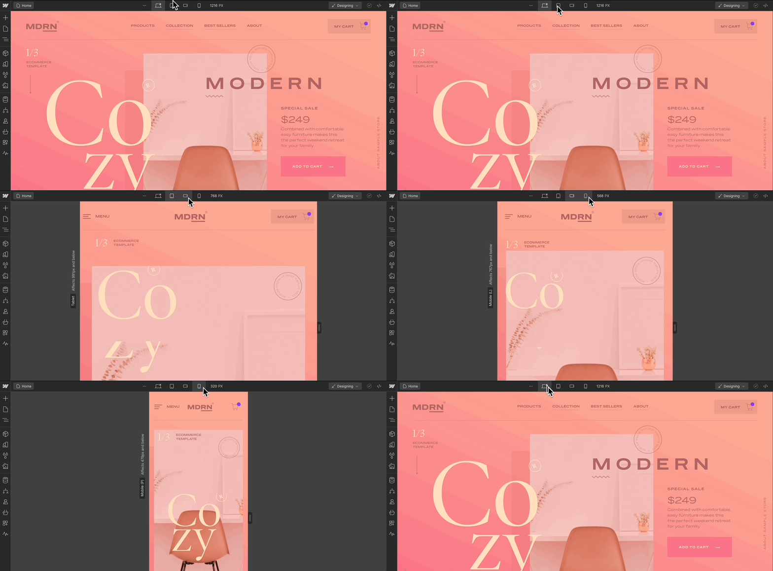
subscribe("mediaquery", callback)Use this method to start listening for specific events in your App. In this case, we're listening for when a user selects a different media query, also known as a breakpoint, in the Designer.
Webflow's built-in responsive breakpoints allow users to customize site designs for different screen sizes. Knowing the current breakpoint can help your app build responsive content that's applicable to different screen sizes and contexts.

Syntax
webflow.subscribe( event: 'mediaquery',callback: (element: null | AnyElement) => void): Unsubscribe;
Parameters
event : "mediaQuery"
The name of the event to subscribe to.
callback: (breakpoint: BreakpointId) => void
This is the function that will be called each time the event occurs. It takes a breakpoint as a parameter. Use this function to define what should happen when the event is triggered.
Returns
Unsubscribe
UnsubscribeThis is a special function you receive after subscribing. When you no longer want to listen to the event, call this function to stop receiving notifications.
Example
/**
 * Subscribe to the 'mediaquery' event and get the Unsubscribe function.
 * This event notifies when the breakpoint changes in the Webflow Designer.
 * @param {BreakpointId} breakpoint - The current breakpoint ID ('xxl', 'xl', 'large', 'main', 'medium', 'small', 'tiny').
 */
const unsubscribeMediaQuery = webflow.subscribe("mediaquery", (breakpoint) => {
  switch (breakpoint) {
    case 'xxl':
      console.log("The current view is for very large screens or high-resolution monitors.");
      break;
    case 'xl':
      console.log("The current view is suitable for large desktop monitors.");
      break;
    case 'large':
      console.log("The current view fits standard desktop monitors.");
      break;
    case 'main':
      console.log("The current view is suitable for smaller desktops or large tablets.");
      break;
    case 'medium':
      console.log("The current view is suitable for tablets and some large phones.");
      break;
    case 'small':
      console.log("The current view is designed for larger mobile devices.");
      break;
    case 'tiny':
      console.log("The current view is for the smallest mobile devices.");
      break;
    default:
      console.log("Unknown breakpoint:", breakpoint);
  }
});

/**
 * Later, when you want to unsubscribe from the 'mediaquery' event:
 * @function
 */
unsubscribeMediaQuery();
