Guide to DevLink
Overview of DevLink
DevLink is a new feature from Webflow Labs that provides the user the ability to utilize Components that are built and maintained in Webflow, to be used in a code environment that is separate from Webflow. We are starting with React.js, and the following documentation will center DevLink’s usage specifically on the Next.js React framework.
DevLink users must agree to the Webflow Labs Terms of Service.
Getting access to DevLink
DevLink is currently in Open Beta. To get access to DevLink, sign up here with your Webflow account email address. We’ll send you an email when it’s been enabled.
Resources
- Reference implementations
- Cloneable made-in-Webflow sites
- DevLink templates
- Webflow University Guide
- Bug report / feature request form
- Getting started with DevLink and Next.js 13
- Getting started with DevLink and older versions of Next.js
Getting set up with DevLink
In the following instructions we will walk through how to set up a new Next.js project, and connect it to your Webflow project.
Create your Next.js project
- Follow the instructions here to set up a new Next.js project
- Run
npm run devto make sure your project runs successfully
Connect to local dev
Here's how to connect your Webflow project with your local dev environment
- Create your Webflow project
- Create a simple component
- Add a button to the canvas
- Right click on the component and select Create component to turn it into a Component
- You should see the component in the Components menu
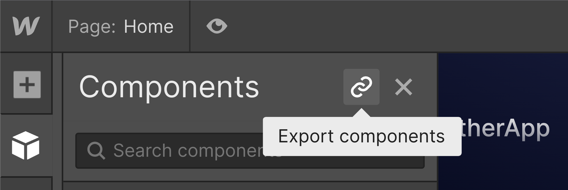
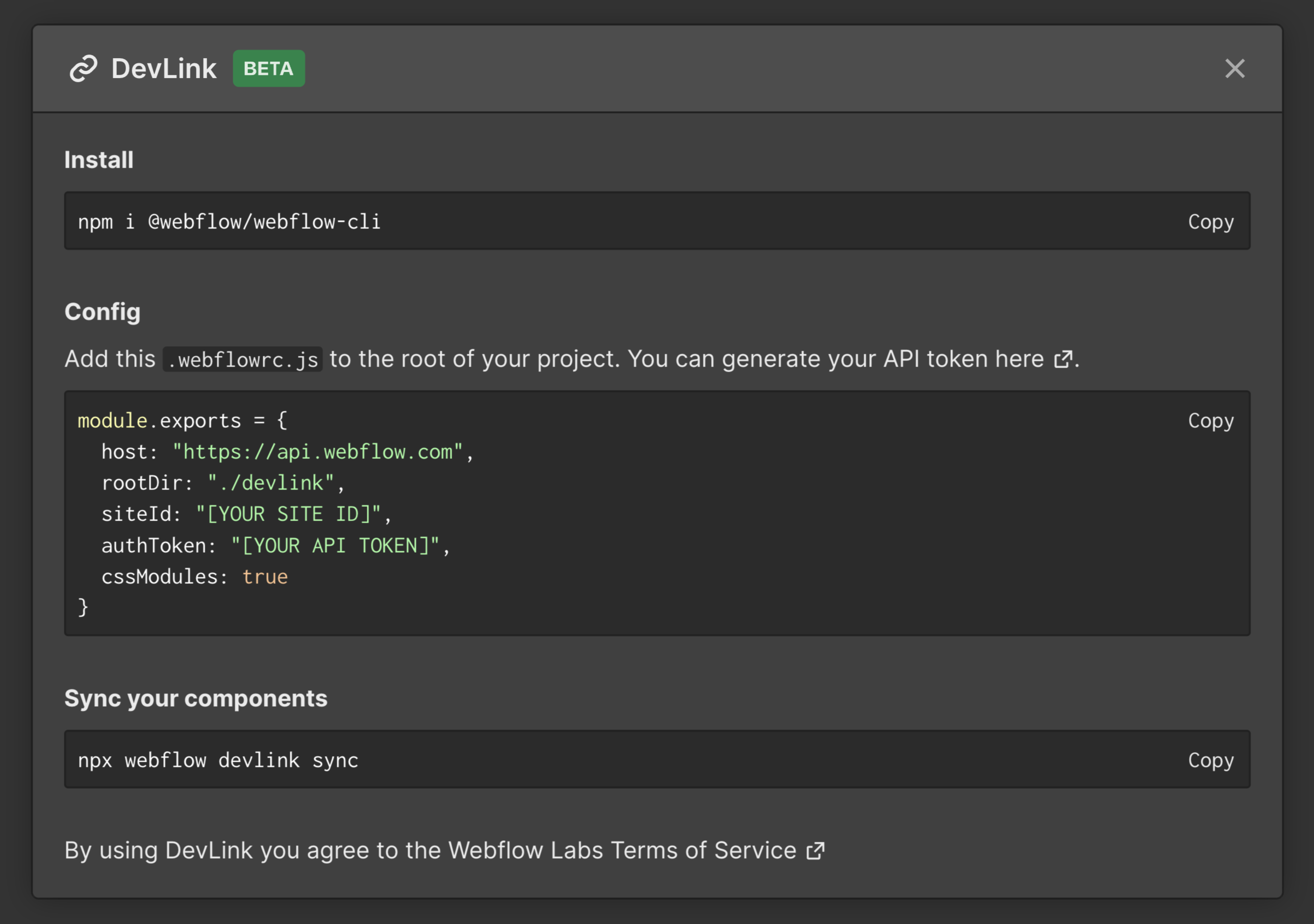
- In the Components menu click on the Export components button to open the Devlink config
- Copy the
.webflowrc.jsfile you see in the modal (Safari users will need to click and select) and paste it into a new file in the root directory of your Next.js project- Replace the “[YOUR API TOKEN]” placeholder with an API access token from your site. You can generate an API key from your project’s integration settings page on the Webflow Dashboard
- Alternatively you can use an env variable so that you'll be able to include the .webflowrc.js file to GitHub without storing the token in plain text
-
module.exports = { authToken: process.env.WF_AUTH_TOKEN } -
export WF_AUTH_TOKEN="[YOUR API KEY]"
-
- Alternatively you can use an env variable so that you'll be able to include the .webflowrc.js file to GitHub without storing the token in plain text
- Save the file
- Replace the “[YOUR API TOKEN]” placeholder with an API access token from your site. You can generate an API key from your project’s integration settings page on the Webflow Dashboard
Installing the NPM module
To install the Webflow CLI npm module run this command in the terminal in the root directory of your next.js project.
npm i @webflow/webflow-cli
Syncing your components
To sync your Webflow components into your project run
-
npx webflow devlink sync
Note: Starter plans have API limits that may shift during the open beta period.
What's supported
Supported elements
Here's a full list of supported Webflow elements that can be exported with DevLink:
Supported Elements
- Background video
- Block Quote
- Button
- Columns
- Container
- Div Block
- Dropdown
- Emphasized
- Figcaption
- Figure
- Form Block
- Form Button
- Form Checkbox
- Form File Upload
- Form Label
- Form Radio Button
- Form reCAPTCHA
- Form Select
- Form Input
- Form Text Area
- Grid
- Heading
- Html Embed
- Icon
- Image
- Link Block
- List
- List Item
- Map
- Navbar
- Paragraph
- Rich Text
- Search
- Section
- Slider
- Subscript
- Superscript
- Tabs
- Text Link
- Video
- YouTube Video
Note: even though they are supported they currently may have bugs or only support certain settings. Please let us know if you run into any bug!
Unsupported Elements
- Collection List
- Ecommerce elements (Cart, Add to cart, Web Payments, PayPal)
- Lottie Animations
- Lightbox
Support for hosted capabilities
Form submissions notifications, CMS, e-commerce, memberships and logic are not supported by DevLink.
Features
Interactions
In order to use Webflow interactions in your DevLinked components you'll need to wrap them with the DevLinkProvider.
In Next.js you can add this to the layout.tsx file so that all pages will have interactions enabled (or _app.tsx on older version of Next.js).
// layout.tsx
import "@/devlink/global.css";
import { DevLinkProvider } from "@/devlink/DevLinkProvider";

export default function RootLayout({
  children,
}: {
  children: React.ReactNode;
}) {
  return (
    <html lang="en">
      <body>
        <DevLinkProvider>
          {children}
        </DevLinkProvider>
      </body>
    </html>
  );
}
// _app.tsx
import "@/devlink/global.css";
import { DevLinkProvider } from "@/devlink/DevLinkProvider";
import type { AppProps } from "next/app";

export default function App({ Component, pageProps }: AppProps) {
  return (
    <DevLinkProvider>
      <Component {...pageProps} />
    </DevLinkProvider>
  );
}
Page interactions
Interactions with page triggers are supported on DevLink components but with a caveat. Because of how page interactions work in Webflow (i.e. they're linked to the specific page the component instance is) DevLink will exports only the first page interaction. So if a component uses multiple page interactions on different pages, only one will be exported.
Styling
Global styles
In order for your components to have access to Webflow's global default styles you'll need to import a css file. In Next.js you can add this to the layout.tsx file so that all pages will have global styles available (or _app.tsx on older version of Next.js).
// layout.tsx

import "@/devlink/global.css";
// _app.tsx

import "@/devlink/global.css";
The global.css stylesheet contains all global style definitions of your Webflow site to be used in your DevLink project. It is exported alongside all your custom components CSS modules and contains:
- Your custom fonts imports (e.g.
@import url(...)) - All global resets from https://github.com/necolas/normalize.css
- Specific classes from base Webflow CSS used by all DevLink supported elements (e.g.
.w-sliderand.w-nav-link) - Form elements resets such as:
button,
[type='button'],
[type='reset']{
  border: 0;
  cursor: pointer;
  -webkit-appearance: button;
}
- Your color swatches (https://university.webflow.com/lesson/use-swatches-for-consistent-color)
:root {
  --lightPink-afebdd45: hsla(0, 100.00%, 86.00%, 1.00);
}
- Custom CSS tag selectors from your site (e.g. "All Links" or "Body (All Pages)" style selector):
a {
  font-weight: 700;
  text-decoration: underline;
}

body {
  font-family: Arial, 'Helvetica Neue', Helvetica, sans-serif;
}
- If you opt-out of CSS modules, it will also contain all styles for your components.
What global.css does not contain is classes set on elements that are not part of any of your components.
Note: classes applied on the body are not included in the global.css stylesheet. If you want to apply a default style on the body so that all your components inherit from it (for example a custom font) then we recommend applying it on the "Body (all pages)" tag selector.
CSS modules
By default Webflow components use css modules to prevent component's css classes from colliding with global styles. If you want you can disable css modules and all styles will be defined globally in global.css. You can do that by updating the cssModules flag in .webflowrc.js.
module.exports = {
  cssModules: false
}
Caveats with custom IDs
In Webflow, the Grid and Quick Stack elements rely on HTML IDs for certain styles (highlighted with a pink indicator in the Style Panel). However, it's also possible to set a custom ID on those elements. If doing so with CSS modules enabled, the custom ID in the exported DevLink component won't match what's been set in the Designer. That's because the ID needs to be adapted to work with the component CSS module. The resulting ID will have this format: ___ so if you need to target it with custom css styles you'll have to use a wildcard selector like [id*="<ComponentName>_<custom-id>__"] { ... }.
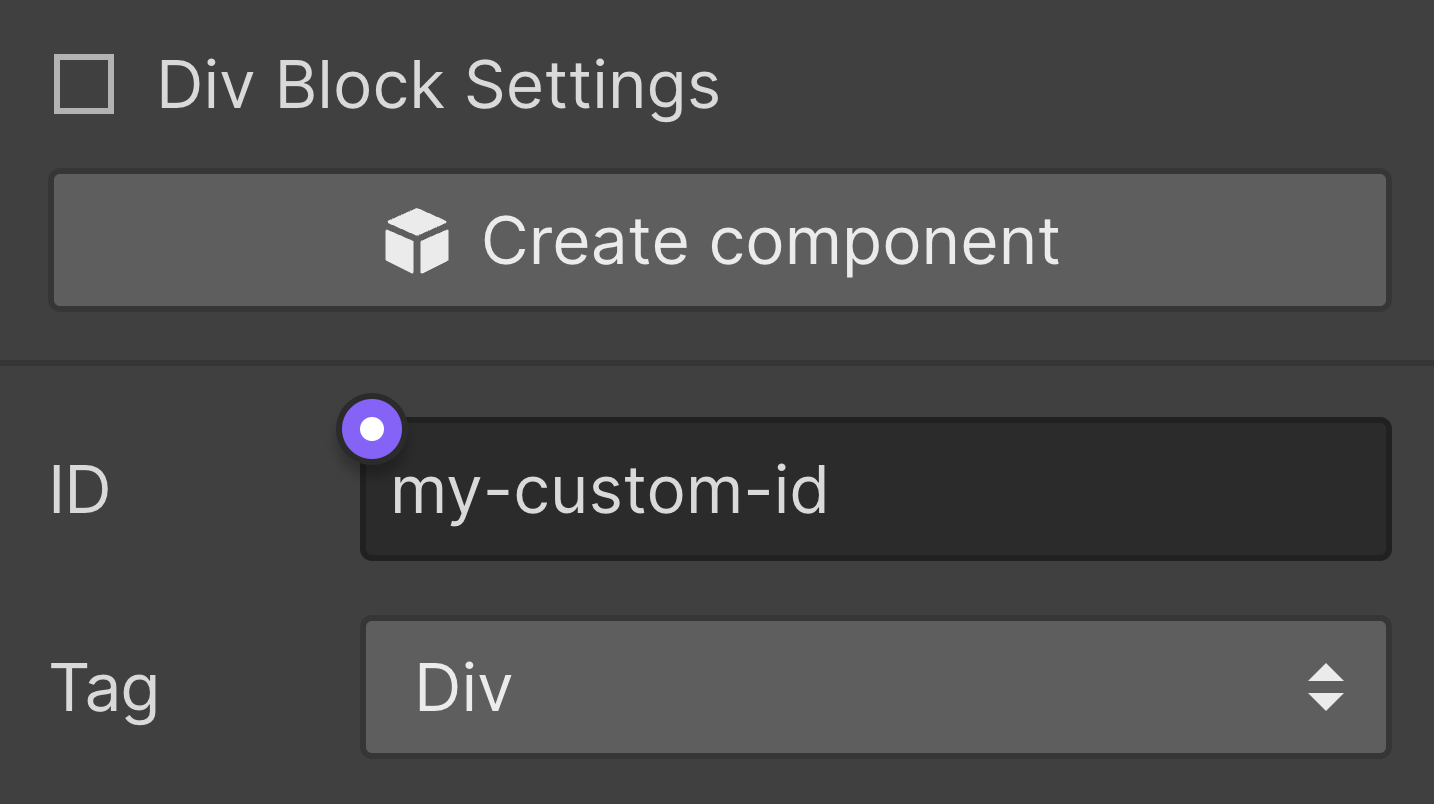
Custom ID
Note: If the custom ID that uses ID styles is also bound to a component property, then there would be no simple way to reference the correct ID CSS selector in the exported DevLink component and apply styles correctly. So instead, by design, component properties are not being bound to an element custom ID if such element relies on ID styles. This is a workaround to make sure elements that rely on ID styles are styled correctly, but also a limitation to be aware of. If you need to reference a specific element with custom code we recommend using custom attributes instead.
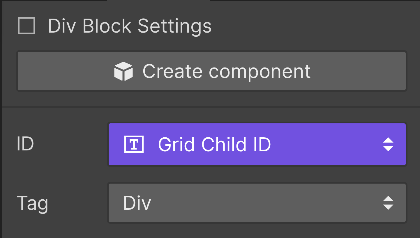
Custom ID bound to a component property
Slots
Slots in Webflow DevLink are meant to provide the user the power of composing components within components. This is a common React.js concept that is used frequently in code bases large and small. You can read more about how slots work in React.js here.
The UI settings for slots will appear in the settings tab of the component that supports slots. You’ll be able to set a name for the slot, which is important, as that will become the name of the React.js component after you DevLink it out.
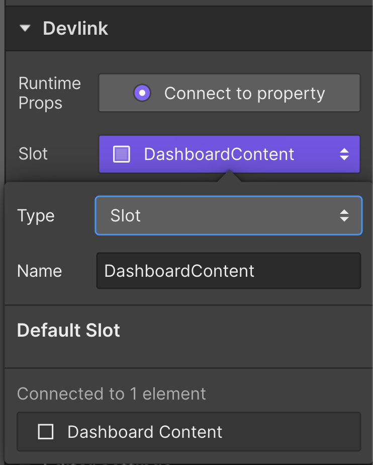
Slot component property
This will turn into:
export function Layout({
  as: Component = Block,
  dashboardContent,
}) {
  return (
    <Component>
      {dashboardContent ?? (
        // Default content
      )}
    </Component>
  );
}
Runtime props
Runtime props can be used to include props that are not covered by Webflow, such as event handlers, or other arbitrary props that, for example, can be provided by third party libraries. By adding a runtime props property to an element, the DevLink compiler will add a new property to your component and spread it in the element it was assigned.
You can include runtime props to your components in the settings tab under the DevLink section. Only certain elements have support for Runtime Props.
You can set Runtime Props in the settings tab after you select a supported element:
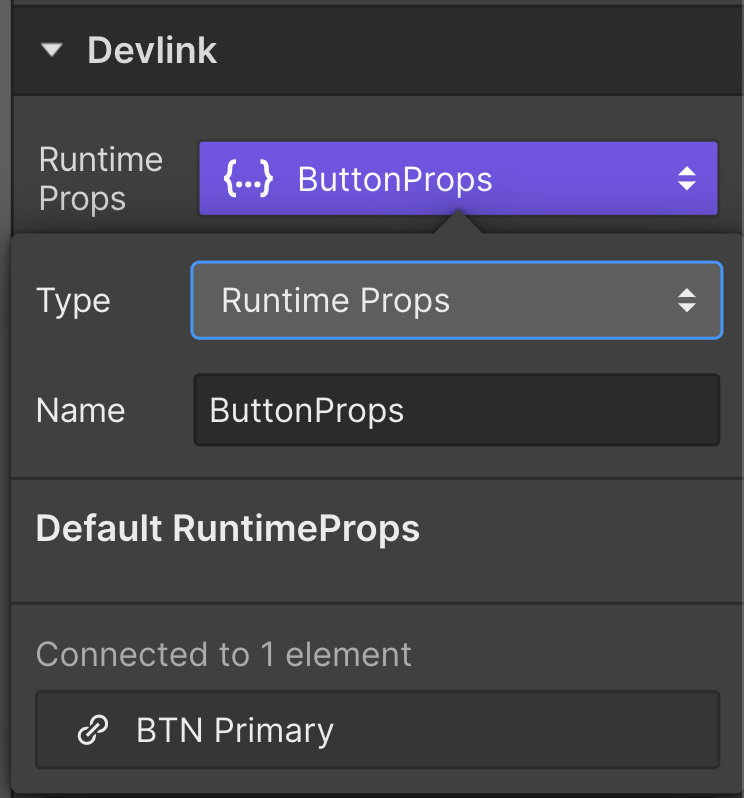
Runtime Props component property
This will turn into:
export function ButtonPrimary({
  as: Component = Link,
  buttonProps = {},
}) {
  return (
    <Component button={true} {...buttonProps}>
      Click me
    </Component>
  );
}
From here, you can set event handlers on the buttonProps property.
Visibility settings
Component visibility properties are supported in DevLink. You can read about how to use them in Webflow University.
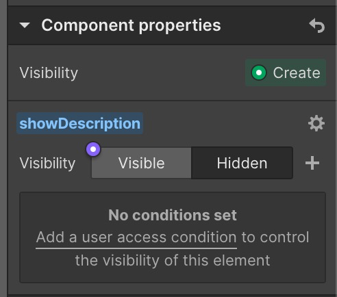
Component visibility property
This will turn into:
export function MyComponent({
  as: Component = Block,
  showDescription = false,
}) {
  return (
    <Component>
    {showDescription ? (
      <_Builtin.Paragraph>
        Lorem ipsum dolor site amet, consectetur adipiscing elit.
      </_Builtin.Paragraph>
    ) : null}
    </Component>
  );
}
Types
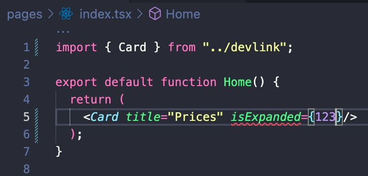
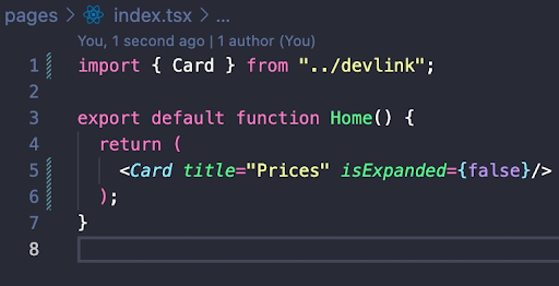
All components are exported with their own declaration file (.d.ts). Using an IDE such as VSCode, autocomplete and type safety is achieved.
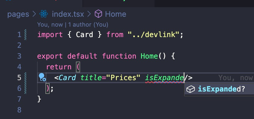
Forms
Webflow forms are supported with DevLink in two ways:
-
You can export an entire form as a single component and work with it as an uncontrolled React form. You will have access to the same set of functionalities as the standard form of any Webflow published site: Three simple states (Normal, Error, and Success) and simple HTML validations. We recommend this approach for simple forms.
-
To use forms this way, add a Runtime Prop to the root element of your form component and pass an onSubmit prop containing your handling function. Consider the following example with a Runtime Prop property called formProps:
import { NativeFormComponent } from "../devlink";

export function PostsPage() {
  return (
    <NativeFormComponent
      // Runtime prop
      formProps={{
    		/* If an exception is raised by this function,
        	 the Error state is automatically rendered.
           Otherwise, Success state is rendered. */
        onSubmit: (e: React.FormEvent<HTMLFormElement>) => {
          e.preventDefault();
          fetch("/posts", {
            body: new FormData(e.target),
            method: "POST",
          });
        },
      }}
    />
  );
}
-
-
Instead of exporting the entire form as a single component, you can also split it into several reusable components and have finer control over state, validation, and submission. To achieve such a result, it is necessary to use several of the previously mentioned DevLink features (Runtime Props, Slots, and Visibility Props). This approach is recommended for complex and highly interactive forms.
- Let's look at an example, using the
react-hook-formlibrary:
import { Controller, useForm } from "react-hook-form"; import { yupResolver } from "@hookform/resolvers/yup"; import * as yup from "yup"; import { Input, Button, FormWrapper } from "../devlink"; // Define custom schema for validation const schema = yup .object({ email: yup.string().email().required(), password: yup.string().min(8).required(), }) .required(); export function LoginForm() { const { handleSubmit, control, formState: { errors }, } = useForm({ resolver: yupResolver(schema), }); return ( // We can use the native HTML form element now that our state is controlled <form onSubmit={handleSubmit((data) => { try { await fetch("/login", { body: data, method: "POST", }); alert("Success!"); } catch (err) { alert("Error!"); } })} > <FormWrapper // Slot formBody={ <> <Controller name="email" control={control} render={({ field }) => ( <Input // Text prop label="Email" // Visibility prop isError={!!errors.email} // Text prop helperMessage={errors.email?.message} // Runtime prop inputProps={{ ...field, placeholder: "Your email", type: "email", "aria-invalid": errors.email ? "true" : "false", }} /> )} /> <Controller name="password" control={control} render={({ field }) => ( <Input label="Password" isError={!!errors.password} helperMessage={errors.password?.message} inputProps={{ ...field, placeholder: "Your password", type: "password", "aria-invalid": errors.password ? "true" : "false", }} /> )} /> <Button /> </> } /> </form> ); } - Let's look at an example, using the
Advanced features
Custom Link and Image components
Certain frameworks like Next.js provide specific components that you can use in your applications like Link and Image. If you want to override DevLink's builtin Link and Image components with your custom ones you can pass them to the DevLinkProvider with the renderLink and renderImage props.
// app/layout.tsx
import "@/devlink/global.css";
import { DevLinkProvider } from "@/devlink/DevLinkProvider";
import { LinkRenderer, ImageRenderer } from "@/components/renderers"; // My custom components

export default function RootLayout({
  children,
}: {
  children: React.ReactNode;
}) {
  return (
    <html lang="en">
      <body>
        <DevLinkProvider renderLink={LinkRenderer} renderImage={ImageRenderer}>
          {children}
        </DevLinkProvider>
      </body>
    </html>
  );
}
// _app.tsx
import "@/devlink/global.css";
import { DevLinkProvider } from "@/devlink/DevLinkProvider";
import { LinkRenderer, ImageRenderer } from "@/components/renderers"; // My custom components
import type { AppProps } from "next/app";

export default function App({ Component, pageProps }: AppProps) {
  return (
    <DevLinkProvider renderLink={LinkRenderer} renderImage={ImageRenderer}>
      <Component {...pageProps} />
    </DevLinkProvider>
  );
}
Examples
In this example we created custom link and image components in a new file /components/renderers.tsx.
"use client";

import Image from "next/image";
import Link from "next/link";
import { RenderLink, RenderImage } from "@/devlink";

export const LinkRenderer: RenderLink = ({
  href,
  className,
  children,
  ...props,
}) => (
  <Link href={href} className={className} {...props}>
    {children}
  </Link>
);

export const ImageRenderer: RenderImage = ({
  src,
  alt,
  height,
  width,
  loading,
  className,
  ...props,
}) => {
  const imgProps = {
    loading,
    className,
    src: src || "",
    alt: alt || "",
    width: width === "auto" ? undefined : (width as number),
    height: height === "auto" ? undefined : (height as number),

    // Note: this will fill the image to its parent element container
    // so you'll need to style the parent container with the desired size.
    fill: width === "auto" || height === "auto",
    ...props,
  };

  return <Image {...imgProps} />;
};
For the Next.js Image component to work with external urls we also have to update next.config.js (more details on their official docs).
module.exports = {
  images: {
    images: {
      domains: ["uploads-ssl.webflow.com"],
    },
  },
};
Advanced settings
Sync a subset of your components
If you have a site with a lot of components you don't need in your React application, you can specify a list of components to sync. Only the components matching your settings will be downloaded when running the sync command. If you have other components from previous syncs they will be deleted (essentially the whole devlink module is overwritten at every sync command).
You can either pass an allowlist of exact component names:
module.exports = {
  components: ["MyComponent1", "MyComponent2"]
}
Or a regular expression:
module.exports = {
  components: "/component/i"
}
Sync specific components
You can also pass a list of exact component names as an argument when running the sync command.
npx webflow devlink sync MyComponent1 MyComponent2
When syncing a specific component like this, the devlink module is not overwritten and all other components will not be deleted.
Crash reports
When something goes wrong and the sync command fails, you will be prompt in the terminal and you'll have the chance to send us a crash report. If you agree to persist your preferences, going forward all crash reports will be sent out automatically without further terminal promps. You can opt-in/out of it by setting the allowTelemetry flag in .webflowrc.js.
module.exports = {
  allowTelemetry: true
}
File extensions
By default all DevLink component files use the .js extension. If you want to use .jsx you can configure it in the .webflowrc.js file.
module.exports = {
  fileExtensions: {
		js: "jsx"
	}
}
Similarly, you can configure your css file extensions. By default they are .css but you could override it to .less for example.
Env variables
Some Webflow elements require an API key to function correctly:
- Maps
- Recaptcha
DevLink does not export your API keys set on your Webflow site, therefore you'll need to provide them via env variables.
export DEVLINK_ENV_GOOGLE_MAPS_API_KEY='<your api key>'
export DEVLINK_ENV_GOOGLE_RECAPTCHA_API_KEY='<your api key>'
If you already have those keys set up in your project and don't want to duplicate them or rename them, you can also provide a mapping in the .webflowrc.js file.
module.exports = {
  envVariables: {
		"GOOGLE_MAPS_API_KEY": "MY_GOOGLE_MAPS_API_KEY",
 		"GOOGLE_RECAPTCHA_API_KEY": "MY_RECAPTCHA_API_KEY"
	}
}
module.exports = {
  images: {
    images: {
      domains: ["uploads-ssl.webflow.com"],
    },
  },
};
Skipping global CSS rules
By default DevLink exports a global.css stylesheet containing opinionated rules and selectors (such as html and h1). If you need to disable this behavior and only include the bare minimum in order for DevLink components to work, you should activate the skipTagSelectors in you .webflowrc configuration file.
module.exports = {
  skipTagSelectors: true,
}
Caveats
<Navbar/>and<Dropdown/>rely on the viewport having sufficient height or width to function properly. When disabling global tags, make sure that the parent elements of your DevLink components have a defined height/width OR your<html/>and<body/>haveheight: 100%;.
Best practices and examples
There are different ways of using DevLink. Many will try to convert an existing full page application into the requisite components to be exported via DevLink. Alternatively many could take a more “design systems” approach, of building components in isolation, creating a library of composable components.
We do not have a specific pedagogical approach to how users use DevLink. We hope to iterate quickly based on user feedback and build functionality that can be most applicable to as many users and workflows as possible.
Component size & structure
A good approach to begin with is to define what type of components you want to build depending on your use case:
- Large “complex” components (like whole sections, navbars, pricing tables, etc) are good when you want to reuse components between your marketing site (made in Webflow) and a web app (coded).
- Small “atomic” components (like buttons, headings, etc.) are best when you want to build a design system in Webflow to be used in a web app.
Remember that DevLink components cannot be “enhanced” with custom code on the dev side (or they can, but when syncing again it’ll override any changes) so we recommend structuring your components so that they can be used only as UI “presentation” components. However, you can pass it your own custom data with component properties (aka. props).
Component properties
Basic properties
Define what parts of your components should always be the same and what can be overridden in each instance of the component being used. For example, a heading or button text might need to be dynamic and be overridden in each instance of the component, so you should bind them to a component property.
Examples of basic component properties are: any text within your component, images, links, videos.
Visibility properties
Use visibility properties if you want to show/hide certain parts of your component dynamically, for example a button component with or without icon.
Runtime Props
Use runtime props on all elements that might require a developer to hook in an event handler like onClick. For example, it's best for all buttons to have runtime props.
You can also use runtime props to override specific styles. For example if I add a wrapperProps property to my Hero component and bind it to the div container that wraps the content inside the component, then I can pass a specific backgroundColor to override the existing style.
<Hero wrapperProps={{ style: { backgroundColor: "#e7ffe6" } }} />;
Or alternatively I could pass it a className (note: this will make it lose any pre-existing classes defined in Webflow so it's not recommended unless you know what you're doing)
<Hero wrapperProps={{ className: "my-global-class" }} />;
Using runtime props is essentially an escape hatch that lets you pass any custom property to the HTML element downstream. You can pass it:
- a
styleobject to set specific inline styles - a
classNameto override the component class - event handlers like
onClickto handle custom logic
Refs
Additionally, runtime props can be used to employ components refs, allowing direct access and manipulation of the underlying DOM elements for more advanced customization.
<Input inputProps={{ ref: inputRef }} />;
Slots
Use slots when you want to leave a placeholder for a developer to include a custom React component within your Webflow component. For example you can build a PageLayout component with a top navbar and a left sidebar built in Webflow, but you want to leave the content of the page to be added by the developer with a custom React component. Then you can create a wrapper Div and bind it to a Slot property. Whatever the developer decides to include in the Slot will be rendered inside the wrapper Div.
Component variants
Having multiple style variants of the same component (e.g. a button component with primary and secondary styles) is not currently possible in Webflow. A workaround is to create a different component for each variant and then in React write your own wrapper component that returns the correct variant based on a prop
import { ButtonPrimary, ButtonSecondary } from "@/devlink";
import React from "react";

type Variant = "primary" | "secondary";

const Button = ({ variant, ...props }: { variant: Variant }) => {
  const BUTTON_VARIANTS: Record<Variant, React.ReactNode> = {
    primary: <ButtonPrimary {...props} />,
    secondary: <ButtonSecondary {...props} />,
  };

  return BUTTON_VARIANTS[variant];
};

export default Button;
Accessibility
DevLink components are as accessible as the underlying Webflow elements. To make all elements fully keyboard accessible we recommend following this guide.
Repeatable content / lists / tables
If you need to render a repeatable lists of data (e.g. a table or list) we recommend dividing your component into two separate components:
- A wrapper "list" component containing a Slot where you want to render your list of data
- An “item” component to render each individual item in the list
For example here we want to use our a UserTable component to render a list of users. We wrapped the list with a User Table Content div that is connected to a Table Content Slot property. Then in the Designer we showcase a list of fake users with the UserTableRow component.
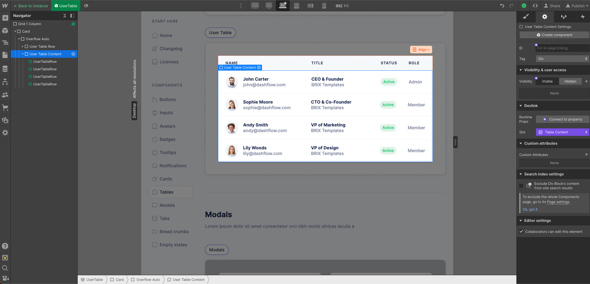
In code we can use the UserTable component to render the outer table and then pass it a list of UserTableRow components (hydrated with our own data) with the tableContent prop.
import { UserTable, UserTableRow } from "@/devlink";
import { useQuery } from "react-query";

// Replace this with your own data
const fetchUsers = () =>
  Promise.resolve([
    {
      id: 1,
      image: "https://d1otoma47x30pg.cloudfront.net/64669c4daefff35dc8536828/64669c4daefff35dc85368b4_sophie-moore-avatar-dashflow-webflow-template-p-130x130q80.jpg",
      name: "Sophie Moore",
      email: "[email protected]",
      jobTitle: "CTO & Co-Founder",
      active: true,
      company: "BRIX Templates",
      role: "Member",
    },
    {
      id: 2,
      image: "https://d1otoma47x30pg.cloudfront.net/64669c4daefff35dc8536828/64669c4daefff35dc85368b6_andy-smith-avatar-dashflow-webflow-template-p-130x130q80.jpg",
      name: "Andy Smith",
      email: "[email protected]",
      jobTitle: "VP of Marketing",
      active: false,
      company: "BRIX Templates",
      role: "Member",
    },
  ]);

const Users = () => {
  const { data: users } = useQuery({
    queryKey: ["users"],
    queryFn: fetchUsers,
  });

  return (
    <UserTable
      tableContent={
        <>
          {(users ?? []).map(({ active, id, ...user }) => (
            <UserTableRow
              {...user}
              key={id}
              greenBadgeVisibility={active}
              redBadgeVisibility={!active}
              greenBadgeText="ACTIVE"
              redBadgeText="INACTIVE"
            />
          ))}
        </>
      }
    />
  );
};

export default Users;
Reusing Webflow classes in custom components
There's different ways to reuse some of the Webflow component classes in any custom element outside of the components, depending on your setup. For example let's say I want to use my primary and secondary Webflow button classes in any other non-Webflow button.
First I'll create a Button component that contains all of my button variants within a wrapper Div.

Then in my custom buttons I can use the primary and secondary classes.
With css modules (recommended)
If using css modules (enabled by default in DevLink) then I can import the button css module and use it to access the classes.
import buttonModule from "@/devlink/Button.module.css";

const MyPrimaryButton = () =>
  <a className={"w-button " + buttonModule["button-primary"]}>Primary button</a>;

const MySecondaryButton = () =>
  <a className={"w-button " + buttonModule["button-secondary"]}>Secondary button</a>;
Note: besides the component class I'm also adding the w-button class which contains Webflow's default button styles.
Without css modules
If not using css modules then all the component classes will be defined globally in the global.css stylesheet so I can simply import that stylesheet and use Webflow classes directly in my buttons.
import "@/devlink/global.css";

const MyPrimaryButton = () =>
  <a className={"w-button button-primary"]}>Primary button</a>;

const MySecondaryButton = () =>
  <a className={"w-button button-secondary"]}>Secondary button</a>;
Note: this is not recommended because component styles can easily bleed into the rest of your application because they're not namespaced.
Using DevLink Builtin elements
If possible, the best option would be to use DevLink Builtin elements directly so that you don't need to worry about setting Webflow default classes and you'll get all of Webflow's logic out-of-the-box (e.g. preload functionality).
import { _Builtin } from "@/devlink";
import buttonModule from "@/devlink/Button.module.css";

const MyPrimaryButton = () => (
  <_Builtin.Link
    className={buttonModule["button-primary"]}
    button={true}
    options={{
      href: "https://webflow.com",
      target: "_blank"
    }}
  >
    Primary Button
  </_Builtin.Link>
);

const MySecondaryButton = () => (
  <_Builtin.Link
    className={buttonModule["button-secondary"]}
    button={true}
    options={{
      href: "https://webflow.com",
      preload: "prefetch"
    }}
  >
    Secondary Button
  </_Builtin.Link>
);
CSS tweaks with custom code
A common pattern for many Webflow users is to incorporate custom CSS tweaks with custom code and using CSS selectors.
<style>
  [class="my-class"] {
    // css styles
  }
</style>
This works within Webflow but can easily break when exporting components with DevLink for two reasons:
- Page custom code is not exported with components
- When using CSS modules (enabled by default with DevLink and recommended) your class selectors will change because they're namespaced with the component name
So in order to make this working with DevLink components you'll need to:
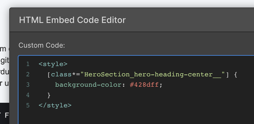
- Use an Embed element inside the component itself (this will be exported)
- Update your CSS selectors to use the pattern
[class*="<ComponentName>_<class-name>__"] { ... }
So for example here I have a component called Hero Section and in it an element with a class Hero Heading Center:
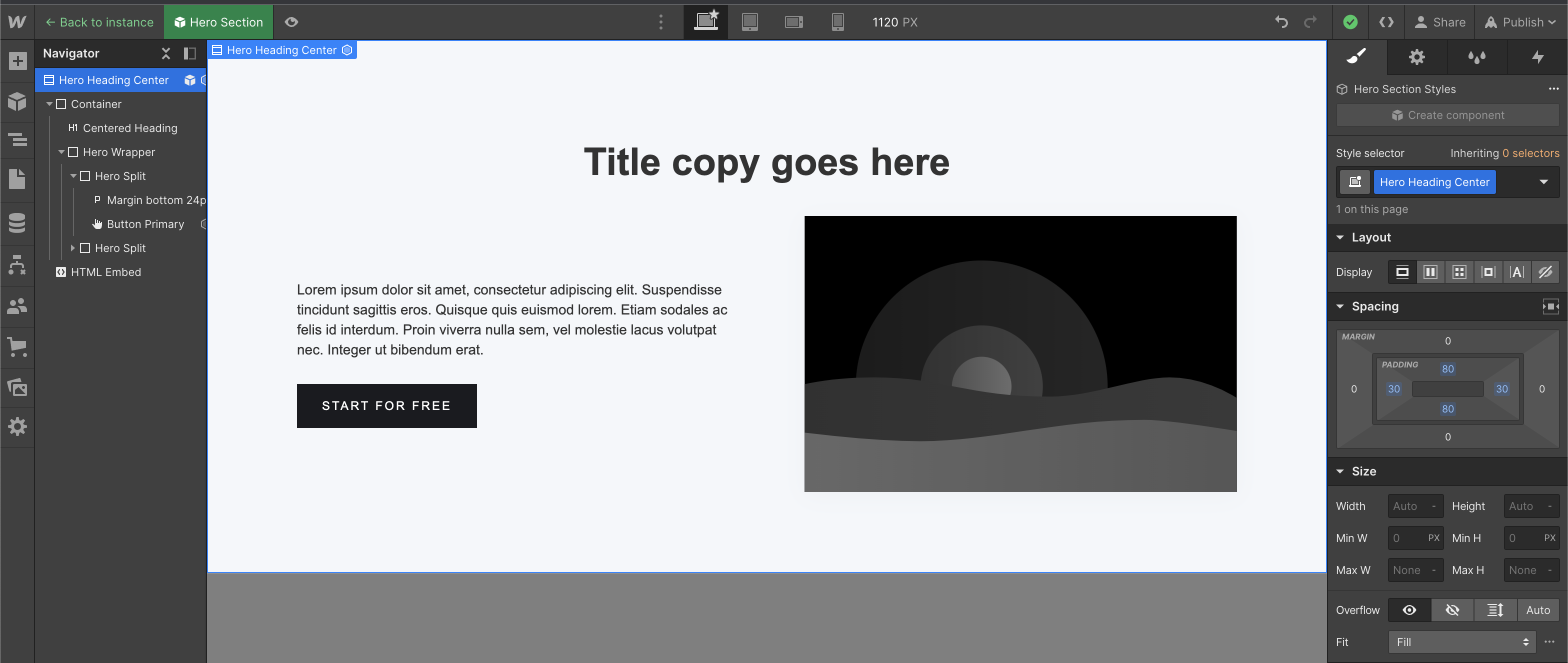
So I can use the selector [class*="HeroSection_hero-heading-center__"] to target the namespaced class, which will stay consistent as long as the component name or class name don't change.
Dark mode with color swatches and css overrides
Webflow doesn't currently support style variants on components so it's not possible to build different color themes of the same component natively in Webflow (instead you'd need to build separate components, one for each color theme e.g. ComponentLight and ComponentDark).
However, it's rather simple to setup DevLink components with different color themes by using swatches and css overrides. Here's how:
- Use color swatches. For all the colors that need to be overridden in your component when switching themes (e.g. dark mode) create a swatch in Webflow. Once exported with DevLink, all color swatches are defined as css variables in the
global.cssstylesheet.
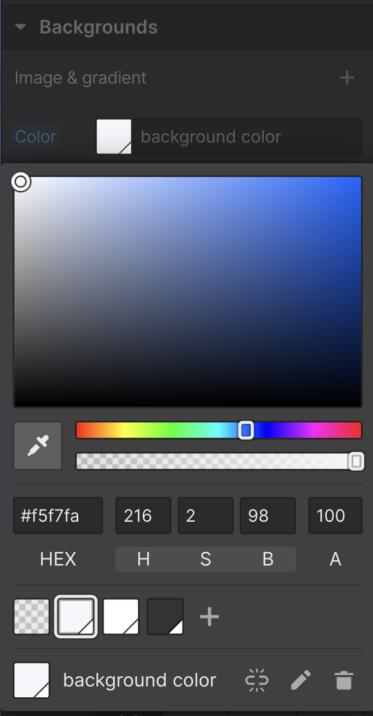
Using a swatch in Webflow

Color swatches in global.css
-
Setup theme overrides. In a separate stylesheet (e.g.
/styles/globals.css) create a theme selector (e.g. dark theme) to override the color swatches values. Make sure to import that stylesheet in your page (e.g. inlayout.tsxor_app.tsxif you're using Next.js). You can have as many themes as you wish.Note: theme color overrides are defined in your own custom CSS and cannot be defined in Webflow.

Dark theme color overrides
- Use a custom attribute bound to a component prop. In the root element wrapper of your component add a custom attribute
data-themeand bind its value to a component prop (e.g.theme).
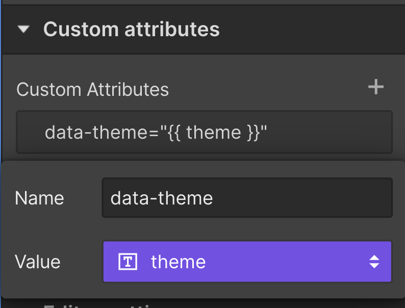
Using data-theme custom attribute
-
Toggle different themes. When using your component you can now pass it a
themeproperty to define what theme to use. You can make that dynamic by using a React state variable.import React from "react"; import {MyComponent} from "@/devlink"; export default function Home() { const [theme, setTheme] = React.useState("light"); const toggleTheme = () => { setTheme(theme === "light" ? "dark" : "light"); }; return ( <> <MyComponent theme={theme} /> <ThemeToggle onClick={toggleTheme} /> </> ); }
Following these simple steps you should be able to implement a dark mode toggle quite easily on your components.
In Next.js
If you're using Next.js there are open source libraries that can help you set this up in an even simpler way. For example by using next-themes you can skip steps 3 and 4 and use the ThemeProvider and useTheme hook to enable dark mode on all your pages without having to manually set a custom attribute on all your components. We recommend reading their documentation for more details.
Override element tag with custom attributes
In Webflow it's not possible to bind an element tag (e.g. <h1>, <h2>, etc. for Heading or <div>, <section>, etc. for Div Block) to a component property. However, sometimes you might want to build reusable and versatile components that can be used in different scenarios with different tags (e.g. a section that can function as a hero or middle-page segment, requiring distinct heading levels).
With DevLink you can do that by using the tag custom attribute and bind it to a component property.
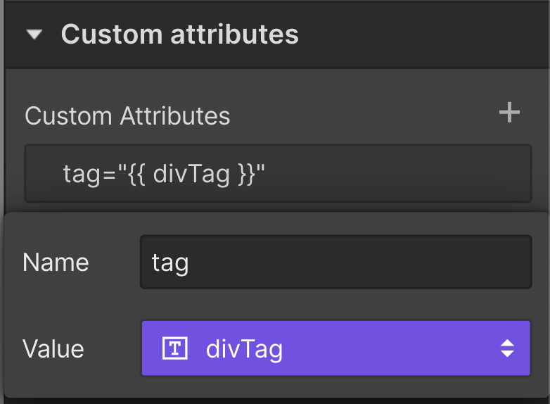
Using a "tag" custom attribute
<MyComponent divTag="section"> // this will render a <section> instead of a <div>
Avoid importing from index.js
Importing from @/devlink may seem convenient, but it can lead to bloated bundles and performance issues. Bundlers may include all components from the directory, even unused ones.
It's better to import specific components directly to avoid this. For example, use import { DevLinkProvider } from "@/devlink/DevLinkProvider" instead of import { DevLinkProvider } from "@/devlink".
Additionally, note that importing from index.js might be deprecated in the future.
Supported frameworks
React
Currently DevLink only supports React and the minimum version required is v16.8.0 (although we recommend using v18 for better performance).
Next.js
DevLink components work out-of-the-box on Next.js. On v13 Next.js introduced the usage of server components, however all DevLink components are client components and use the "use client" directive.
Vite
Vite does not allow usage of JSX syntax within .js files by default so we recommend configuring the jsx file extension in .webflowrc. Additionally, if you're using create-vite by default it configures your project to use ES modules, so you should change your .webflowrc file to use export default { ... } syntax or to use .cjs extension.
export default {
  fileExtensions: {
		js: "jsx"
	}
}
module.exports = {
  fileExtensions: {
		js: "jsx"
	}
}
Create React App
Create React App by default doesn't support relative imports outside of the /src folder so we recommend moving your DevLink components inside /src.
module.exports = {
  rootDir: "./src/devlink",
}
Additionally, the default ESLint rules won't play well with DevLink components so you might want to disable ESLint for the whole /devlink folder by adding ./src/devlink/** to .eslintignore and adding EXTEND_ESLINT=true to your .env file.
Gatsby
If you wish to use DevLink components with CSS modules in your Gatsby application, follow these steps:
- Make sure the the
./devlinkfolder is ignored by ESLint by adding./devlink/**to.eslintignore. - Create a
./gatsby-node.jsfile at the root of your project and add the following code:
const path = require("path");

exports.onCreateWebpackConfig = ({ actions, rules, getConfig, stage }) => {
  const config = getConfig();

  const cssRulesPredicate = (rule) =>
    !rule.oneOf?.findIndex(
      ({ test }) => String(test) !== String(/\.module\.css$/)
    ) > 0;

  config.module.rules = [
    ...config.module.rules.filter(cssRulesPredicate),
    {
      oneOf: [
        {
          use: [
            "style-loader",
            {
              loader: "css-loader",
              options: {
                importLoaders: 1,
                modules: {
                  localIdentContext: path.resolve(__dirname, "devlink"),
                  localIdentName: stage.includes("build")
                    ? "[hash:base64]"
                    : "[name]_[local]__[hash:hex:5]",
                },
              },
            },
          ],
          test: /devlink\/.*\.module\.css$/,
        },
        {
          ...rules.cssModules(),
          exclude: (modulePath) => /devlink\/.*\.module\.css$/.test(modulePath),
        },
        rules.css(),
      ],
    },
  ];

  actions.replaceWebpackConfig(config);
};
- Note: If you're exporting your DevLink components to a different folder than
./devlinkmake sure to update these configurations.
Tailwind CSS
Some rules from global.css might conflict with the defaults set by Tailwind CSS. If you wish to use DevLink and Tailwind CSS on the same project we recommend enabling skipTagSelectors.
Limits
For safety reasons, DevLink syncs have the following limits per site/project, currently:
- 80 components on free workspace plans
- 500 components on upgraded workspace plans
If these limits are hit, the webflow-cli will display the following message: You exceeded the limit of components and some components were not exported.
Reporting issues
If you encounter any bugs or have feature requests, please let us know here.
Updated 4 months ago
